Hello folks! Find below solutions to the exercise problems and a variety of extra questions of many formats for practice. We advise that you work out the problems yourselves alongside studying them. This will boost your understand and retention.
Solutions to Exercise 4.1 (Page No 44) of NCERT Class 8 Mathematics Chapter 4 Data Handling:
1. A survey was made to find the type of music that a certain group of young people liked in a city. Adjoining pie chart shows the findings of this survey.
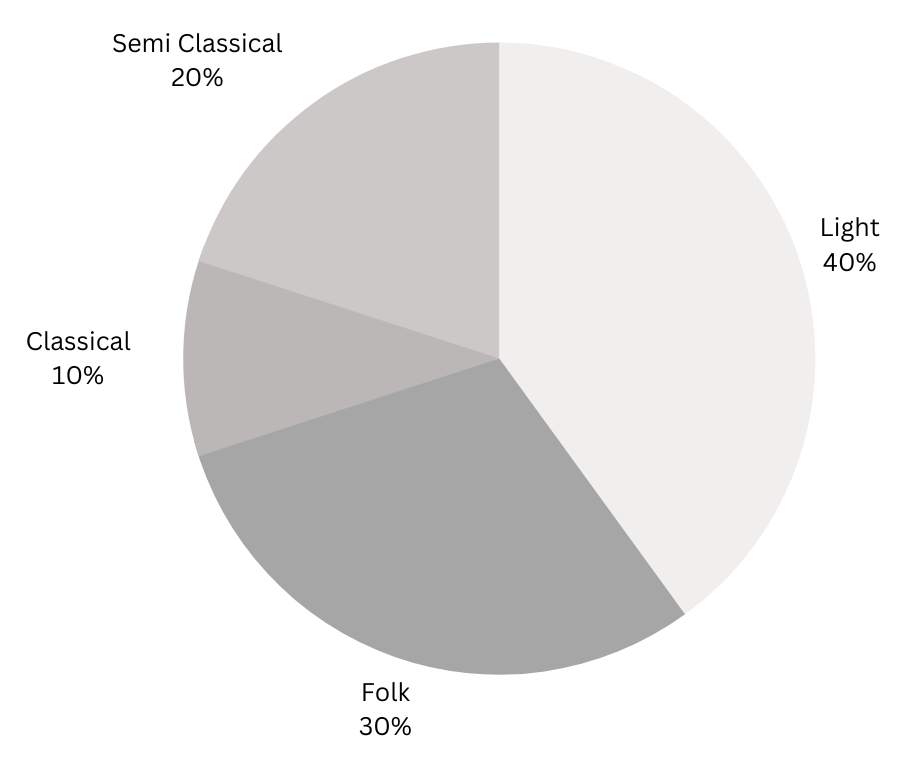
From this pie chart answer the following:
(i) If 20 people liked classical music, how many young people were surveyed?
(ii) Which type of music is liked by the maximum number of people?
(iii) If a cassette company were to make 1000 CDs, how many of each type would they make?
Answers:
(i) If 20 people liked classical music, how many young people were surveyed?
Let the number of young people surveyed be x.
From the pie chart we get that 10% likes classical music.
Therefore,
10/100 × (x) = 20
or, x = 20 × 100/10
or, x = 200
Therefore, number of young people that were surveyed = 200.
(ii) Which type of music is liked by the maximum number of people?
From the pie chart it can be seen that the maximum number of people (40%) likes light music.
(iii) If a cassette company were to make 1000 CDs, how many of each type would they make?
Number of CDs of light music to be made = 40/100 × 1000 = 400.
Number of CDs of folk music to be made = 30/100 × 1000 = 300.
Number of CDs of classical music to be made = 10/100 × 1000 = 100.
Number of CDs of semi classical music to be made = 20/100 × 1000 = 200.
Summary: From the pie chart we calculate that (i) 200 young people were surveyed. (ii) Light music is liked by the maximum number of people. (iii) The cassette company should make 400 light music CDs, 300 folk music CDs, 100 classical music CDs and 200 semi classical CDs.
2. A group of 360 people were asked to vote for their favourite season from the three seasons rainy, winter and summer.

(i) Which season got the most votes?
(ii) Find the central angle of each sector.
(iii) Draw a pie chart to show this information.
Answers:
(i) From the given table we can see that winter season got the most number of votes with 150.
(ii) Central angle of each season = (Number of votes for season)/(Total number of votes) × 3600
Central angle of summer sector = 90/360 × 3600 = 900.
Central angle of rainy sector = 120/360 × 3600 = 1200.
Central angle of winter sector = 150/360 × 3600 = 1500.
(iii) Draw the pie chart:
1. Draw a circle with a vertical radius and mark the centre as O.
2. Now place your protractor along the radius with its centre on O and draw the 900 angle for summer.
3. Continue marking the remaining sectors.
The finished pie chart is shown below:
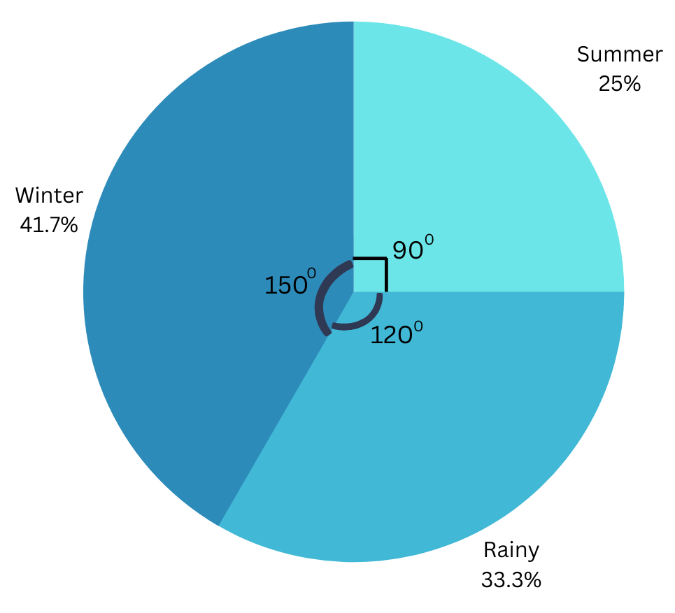
Summary: (i)From the given table we can see that winter season got the most number of votes. (ii) Central angle of summer sector = 900. Central angle of rainy sector = 1200. Central angle of winter sector = 1500. (iii) The required pie chart is drawn using the procedure described.
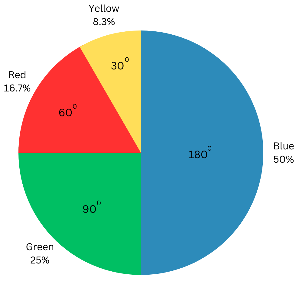
3. Draw a pie chart showing the following information. The table shows the colours preferred by a group of people.
| Colours | Number of people |
| Blue | 18 |
| Green | 9 |
| Red | 6 |
| Yellow | 3 |
| Total | 36 |
Answer:
Central angle for blue = 18/36 × 3600 = 1800.
Central angle for green = 9/36 × 3600 = 900.
Central angle for red = 6/36 × 3600 = 600.
Central angle for yellow = 3/36 × 3600 = 300.
Draw the pie chart:
1. Draw a circle with a vertical radius and mark the centre as O.
2. Now place your protractor along the vertical radius with its centre on O and draw the 1800 angle for blue.
3. Continue marking the remaining sectors.
The finished pie chart is shown below:
4. The adjoining pie chart gives the marks scored in an examination by a student in Hindi, English, Mathematics, Social Science and Science.
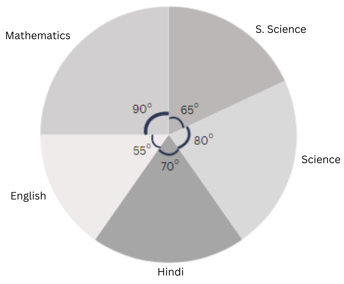
If the total marks obtained by the students were 540, answer the following questions.
(i) In which subject did the student score 105 marks?
(Hint: for 540 marks, the central angle = 360°. So, for 105 marks, what is the central angle?)
(ii) How many more marks were obtained by the student in Mathematics than in Hindi?
(iii) Examine whether the sum of the marks obtained in Social Science and Mathematics is more than that in Science and Hindi (Hint: Just study the central angles).
Answer:
(i) In which subject did the student score 105 marks?
For 540 marks, the central angle = 360°.
Therefore, for 105 marks, the central angle = 105/540 × 3600 = 700.
From the pie chart we can see that the sector angle for Hindi is 700. Hence, the student scored 105 marks in Hindi.
(ii) How many more marks were obtained by the student in Mathematics than in Hindi?
The sector angle for Mathematics = 900.
We know 3600 corresponds to 540 marks.
Therefore, the number of marks scored in Mathematics = 90/360 × 540 = 135.
The student obtained (135 – 105) = 30 marks more in Mathematics in Hindi.
(iii) Examine whether the sum of the marks obtained in Social Science and Mathematics is more than that in Science and Hindi.
By studying the central angles, we get the total angle occupied by Social Science and Mathematics together = 900 + 650 = 1550. The total angle occupied by Science and Hindi together = 800 + 700 = 1500.
The angle occupied by Social Science and Mathematics together is more. So we can say that the sum of marks obtained in Social Science and Mathematics is more than that in Science and Hindi.
We also calculate the marks scored in each subject to confirm the answer:
| Subjects | Central Angle | Marks Scored |
| Hindi | 700 | 70/360 × 540 = 105 |
| English | 550 | 55/360 × 540 = 82.5 |
| Mathematics | 900 | 90/360 × 540 = 135 |
| Social Science | 650 | 65/360 × 540 = 97.5 |
| Science | 800 | 80/360 × 540 = 120 |
Sum of marks obtained in Social Science and Mathematics = (97.5 + 135) = 232.5 marks.
Sum of marks obtained in Science and Hindi= (120 + 105) = 225 marks.
Therefore, the sum of the marks obtained in Social Science and Mathematics is = (232.5 – 225) = 7.5 marks more than the sum obtained in Science and Hindi.
Summary: (i) The student scored 105 marks in Hindi. (ii) The student obtained 30 marks more in Mathematics in Hindi. (iii) By studying the central angles, we see that the sum of the marks obtained in Social Science and Mathematics 7.5 marks more than the sum obtained in Science and Hindi.
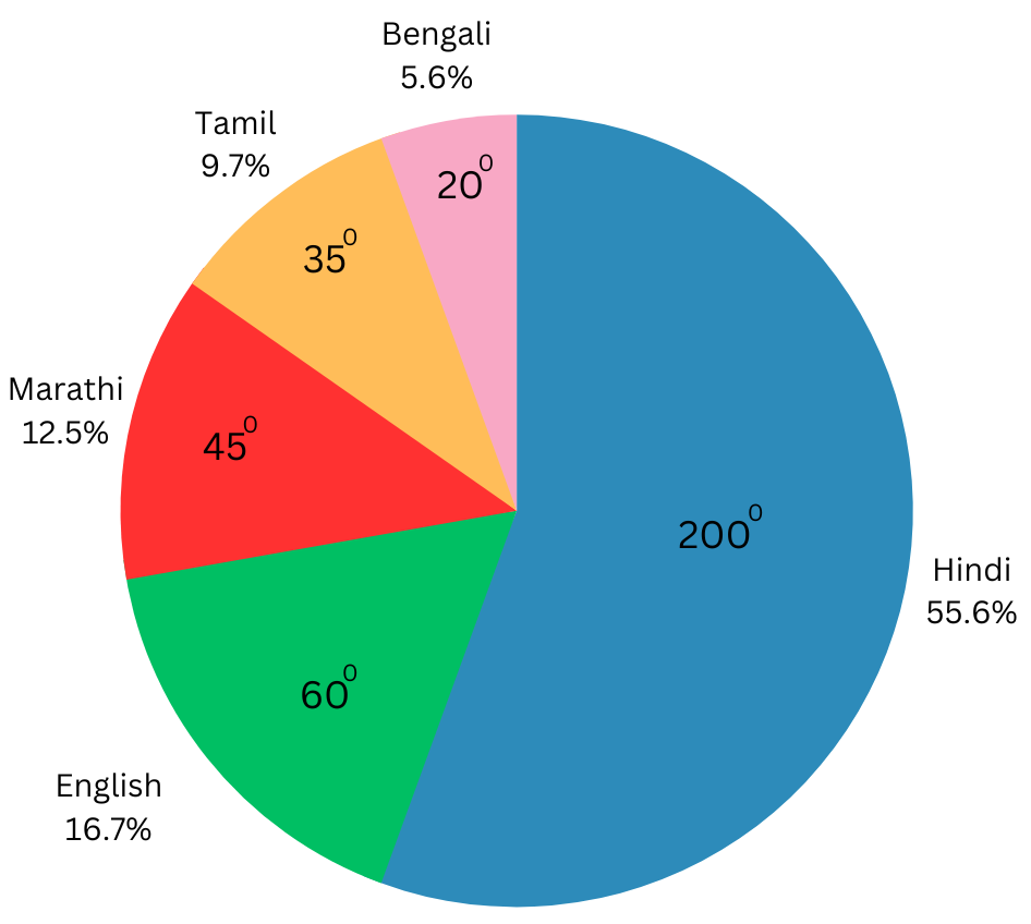
5. The number of students in a hostel speaking different languages is given below. Display the data in a pie chart.
| Language | Hindi | English | Marathi | Tamil | Bengali | Total |
| Number of students | 40 | 12 | 9 | 7 | 4 | 72 |
Answer:
We make a table to find the central angle of the sectors.
| Subjects | No of Students | Fraction | Fraction of 3600 (Central Angle) |
| Hindi | 40 | 40/72 = 5/9 | 5/9 × 3600 = 2000 |
| English | 12 | 12/72 = 1/6 | 1/6 × 3600 = 600 |
| Marathi | 9 | 9/72 = 1/8 | 1/8 × 3600 = 450 |
| Tamil | 7 | 7/72 | 7/72 × 3600 = 350 |
| Bengali | 4 | 4/72 = 1/18 | 1/18 × 3600 = 200 |
| Total | 72 |
Draw the pie chart:
1. Draw a circle with a vertical radius and mark the centre as O.
2. Now place your protractor along the vertical radius with its centre on O and draw the 2000 angle for Hindi.
3. Continue marking the remaining sectors.
The finished pie chart is shown below:
Solutions to Exercise 4.2 (Page No 49) of NCERT Class 8 Mathematics Chapter 4 Data Handling:
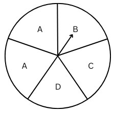
1. List the outcomes you can see in these experiments.
(a) Spinning a wheel
(b) Tossing two coins together
Answer:
(a)There are 4 distinct letters A, B, C and D on the wheel because 1 A is repeated. Therefore, there are 4 possible outcomes.
(b)When two coins are tossed together we get four possible outcomes: HH, HT, TH, TT (H = Head and T = Tail).
2. When a die is thrown, list the outcomes of an event of getting
(i) (a) a prime number (b) not a prime number
(ii) (a) a number greater than 5 (b) a number not greater than 5
Answer:
When the die is thrown the six possible outcomes are 1, 2, 3, 4, 5 and 6.
(i) (a) Outcomes of getting a prime number are 2, 3, 5. (b) Outcomes of not getting a prime number are 1, 4, 6.
(ii) (a) Outcome of getting a number greater than 5is 6. (b) Outcomes of getting a number not greater than 5 are 1, 2, 3, 4, 5.
3. Find the.
(a) Probability of the pointer stopping on D in (Question 1-(a))?
(b) Probability of getting an ace from a well-shuffled deck of 52 playing cards?
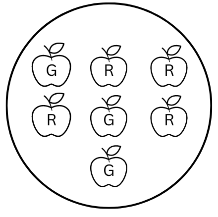
(c) Probability of getting a red apple. (See figure below)
Answers:
Probability = (Number of outcomes that make the event)/(Total number of outcomes)
(a) There are 5 possible letters A, A, B, C, D the pointer could stop at. So number of possible outcomes = 5. Therefore, probability of pointer stopping at D = 1/5.
(b) There are 4 aces in a deck of 52 playing cards. So there are 4 events of getting an ace.
Therefore, probability of getting an ace = 4/52 = 1/13.
(c) There are 4 red apples out of a total number of 7 apples. So, there are 4 events of getting an apple.
Therefore, probability of getting a red apple = 4/7.
Summary: Probability is number of outcomes that make the event divided by total number of outcomes. (a) Probability of the pointer stopping on D in (Question 1-(a)) is 1/5. (b) Probability of getting an ace = 1/13. (c) Probability of getting a red apple = 4/7.
4. Numbers 1 to 10 are written on ten separate slips (one number on one slip), kept in a box and mixed well. One slip is chosen from the box without looking into it. What is the probability of.
(i) getting a number 6?
(ii) getting a number less than 6?
(iii) getting a number greater than 6?
(iv) getting a 1-digit number?
Answers:
Probability = (Number of outcomes that make the event)/(Total number of outcomes)
(i) Number of possible outcomes of getting a number 6 out of ten slips numbered 1 to 10 is 1.
Therefore, probability of getting a number 6 = 1/10.
(ii) Number of possible outcomes of getting a number less than 6 are 1, 2, 3, 4, 5.
Therefore, probability of getting a number less than 6 = 5/10 = 1/2 .
(iii) Number of possible outcomes of getting a number greater than 6 are 7, 8, 9, 10.
Therefore, probability of getting a number greater than 6 = 4/10 = 2/5 .
(iv) The one-digit numbers from 1 – 10 are 1, 2, 3, 4, 5, 6, 7, 8, 9.
Therefore, probability of getting a 1-digit number = 9/10.
Summary: When one slip is chosen from the box with slips numbered 1 – 10, the probability of (i) getting a number 6 is 1/10, (ii) getting a number less than 6 is 1/2, (iii) getting a number greater than 6 is 2/5 and (iv) getting a 1-digit number is 9/10.
5. If you have a spinning wheel with 3 green sectors, 1 blue sector and 1 red sector, what is the probability of getting a green sector? What is the probability of getting a non blue sector?
Answer:
There are 3 green, 1 blue and 1 red sectors.
So number of possible outcomes = 3 + 1 + 1 = 5.
Therefore, probability of getting a green sector = 3/5.
There is 1 blue sector. So, number of non-blue sectors = 5 – 1 = 4.
Therefore, probability of getting a non-blue sector = 4/5.
Summary: If you have a spinning wheel with 3 green sectors, 1 blue sector and 1 red sector, the probability of getting a green sector is 3/5 and the probability of getting a non-blue sector = 4/5.
6. Find the probabilities of the events given in Question 2.
Answer:
When the die is thrown the six possible outcomes are 1, 2, 3, 4, 5 and 6.
(i) (a) Outcomes of getting a prime number are 2, 3, 5. So, there are 3 outcomes out of a possible 6. Therefore, probability = 3/6 = 1/2.
(b) Outcomes of not getting a prime number are 1, 4, 6. So, there are 3 outcomes out of a possible 6. Therefore, probability = 3/6 = 1/2.
(ii) (a) Outcome of getting a number greater than 5 is 6. So, there is 1 outcomes out of a possible 6. Therefore, probability = 1/6.
(b) Outcomes of getting a number not greater than 5 are 1, 2, 3, 4, 5. So, there are 5 outcomes out of a possible 6. Therefore, probability = 5/6.
Summary: When a die is thrown (i) (a) probability of getting a prime number is 1/2, (i) (b) probability of not getting a prime number is 1/2, (ii) (a) probability of getting a number greater than 5 is 1/6 and (ii) (b) probability of getting a number not greater than 5 is 5/6.
Important Questions from Previous NCERT Textbook:
Exercise 5.1 Page No: 76 (Old Textbook):
1. For which of these would you use a histogram to show the data?
(a) The number of letters for different areas in a postman’s bag.
(b) The height of competitors in an athletics meet.
(c) The number of cassettes produced by 5 companies.
(d) The number of passengers boarding trains from 7.00 a.m. to 7.00 p.m. at a station.
Give reasons for each.
Answers:
The data in (b) and (d) can be shown using a histogram. The data in (b) and (d) can be divided into groups or class intervals of equal width, which is necessary to make a histogram.
The data in (a) and (c) are for distinct categories and cannot be divided into class intervals. Hence they cannot be represented using a histogram.
Explanation:
Case: (b) The height of competitors in an athletics meet.
The height of competitors can be divided into class intervals of equal width in the following way (example):
| Class Interval (Height in cm) | Frequency (Number of competitors) |
| 150 – 160 | 2 |
| 160 – 170 | 4 |
| 170 – 180 | 8 |
| 180 – 190 | 6 |
| 190 – 200 | 1 |
Hence, this data can be represented by using a histogram.
Case: (d) The number of passengers boarding trains from 7.00 a.m. to 7.00 p.m. at a station
The time of boarding trains can be divided into class intervals of equal width in the following way (example):
| Class Interval (Time in Hours) | Frequency (Number of passengers) |
| 7 am – 8 am | 200 |
| 8 am – 9 am | 400 |
| 9 am – 10 am | 700 |
| 10 am – 11 am | 900 |
| 11 am – 12 pm | 700 |
| And so on until 7 pm |
Hence, this data can be represented by using a histogram.
Case: (a) The number of letters for different areas in a postman’s bag.
The data is for different categories (areas) and are not continuous measurements, hence a bar graph would be suitable.
Case: (c) The number of cassettes produced by 5 companies.
The data is for different categories (companies) and are not continuous measurements, hence a bar graph would be suitable.
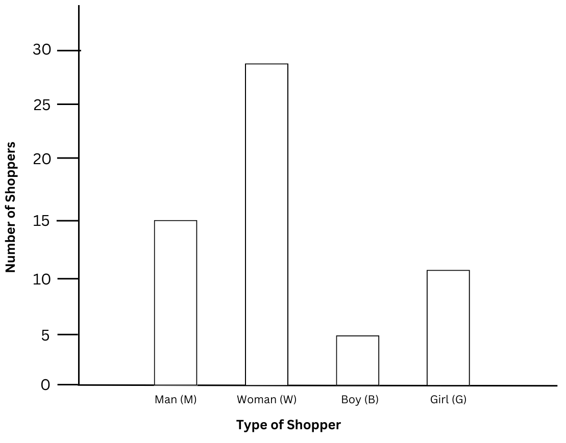
2. The shoppers who come to a departmental store are marked as: man (M), woman (W), boy (B) or girl (G). The following list gives the shoppers who came during the first hour of the morning:
W W W G B W W M G G M M W W W W G B M W B G G M W W M M W W W M W B W G M W W W W G W M M W W M W G W M G W M M B G G W.
Make a frequency distribution table using tally marks. Draw a bar graph to illustrate it.
Answer:
The frequency distribution table using tally marks is shown below:
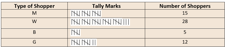
The bar graph is shown below:
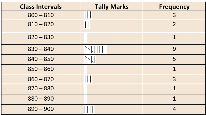
3. The weekly wages (in ₹) of 30 workers in a factory are:
830, 835, 890, 810, 835, 836, 869, 845, 898, 890, 820, 860, 832, 833, 855, 845, 804, 808, 812, 840, 885, 835, 835, 836, 878, 840, 868, 890, 806, 840.
Using tally marks make a frequency table with intervals as 800 – 810, 810 – 820 and so on.
Answer:
The frequency distribution table using tally marks is shown below:
4. Draw a histogram for the frequency table made for the data in Question 3 and answer the following questions.
(i) Which group has the maximum number of workers?
(ii) How many workers earn ₹ 850 and more?
(iii) How many workers earn less than ₹ 850?
Answer:
The histogram for the frequency table made for the data in Question 3 is shown below:
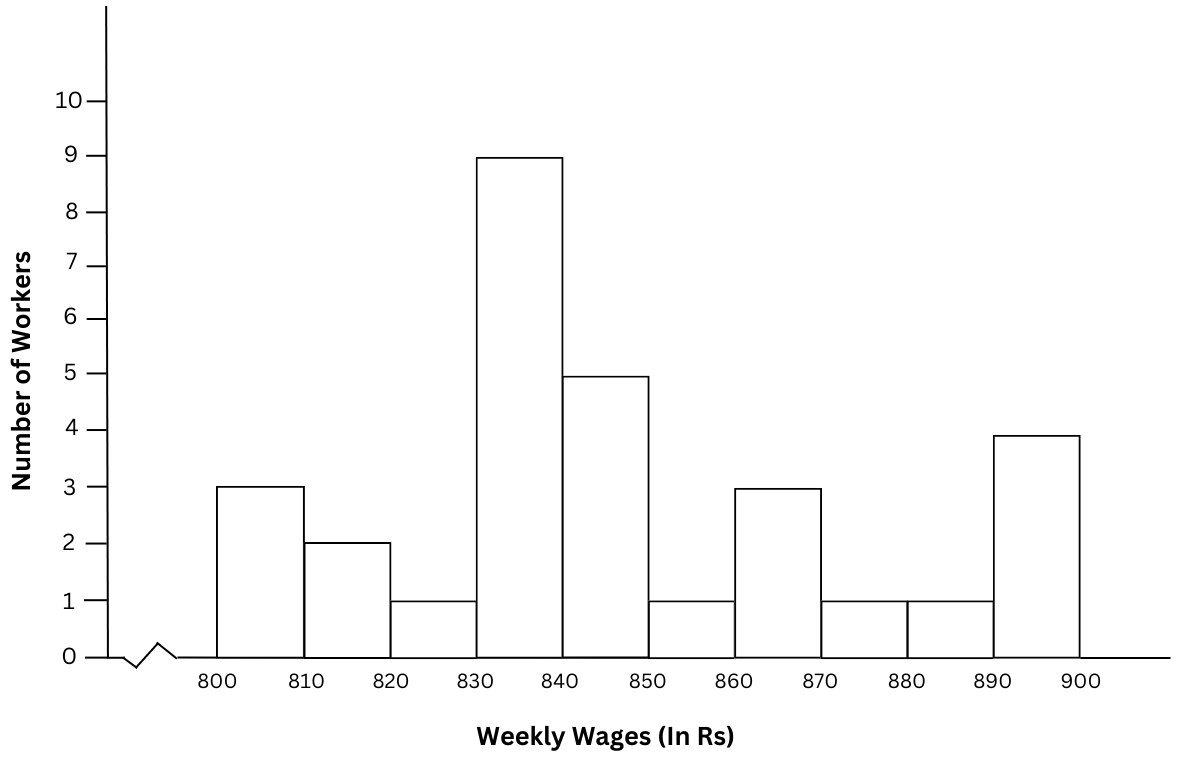
(i) Which group has the maximum number of workers?
The group 830 – 840has the maximum number of workers = 9.
(ii) How many workers earn ₹ 850 and more?
Number of workers who earn ₹ 850 and more = 1 + 3 + 1 + 1 + 4 = 10.
(iii) How many workers earn less than ₹ 850?
Number of workers who earn less than ₹ 850 = 3 + 2 + 1 + 9 + 5 = 20.
Summary: The histogram for the frequency table made for the data is shown above. (i) The group 830 – 840has the maximum number of workers. (ii) Number of workers who earn ₹ 850 and more = 10. (iii) Number of workers who earn less than ₹ 850 = 20.
5. The number of hours for which students of a particular class watched television during holidays is shown in the given graph.
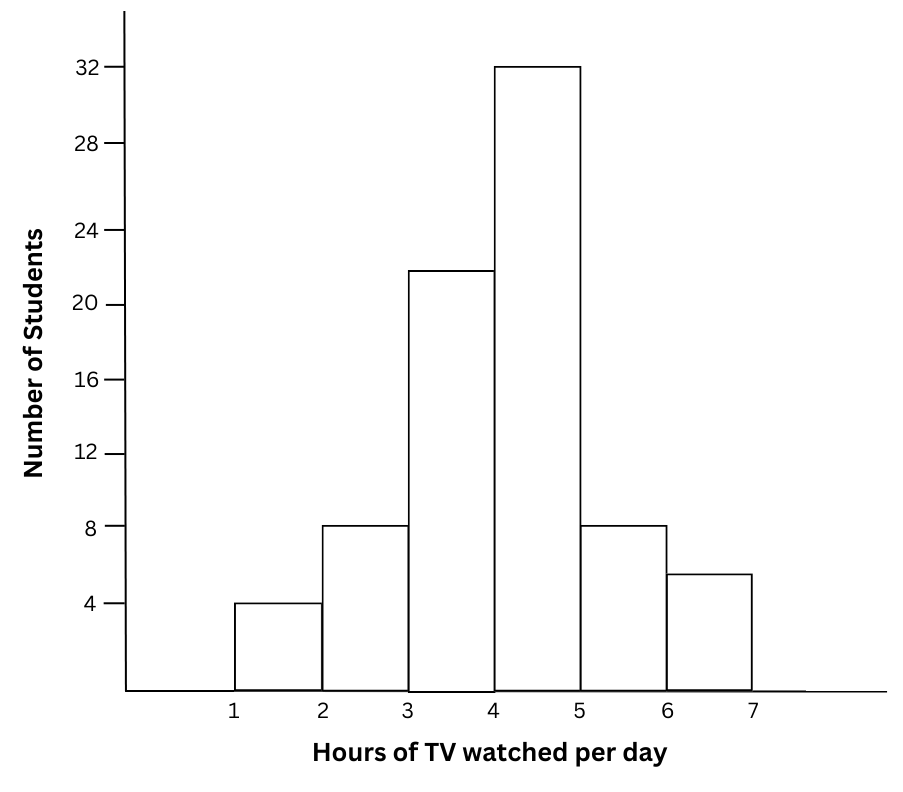
Answer the following:
(i) For how many hours did the maximum number of students watch TV?
(ii) How many students watched TV for less than 4 hours?
(iii) How many students spent more than 5 hours in watching TV?
Answers:
(i) For how many hours did the maximum number of students watch TV?
The maximum number of students = 32 students watched TV for 4 – 5 hours.
(ii) How many students watched TV for less than 4 hours?
The number of students who watched TV for less than 4 hours = 4 + 8 + 22 = 34.
(iii) How many students spent more than 5 hours in watching TV?
The number of students whospent more than 5 hours in watching TV = 8 + 6 = 14.
Summary: Based on the given graph: (i) The maximum number of students watched TV for 4 – 5 hours. (ii) The number of students who watched TV for less than 4 hours = 34. (iii) The number of students whospent more than 5 hours in watching TV = 14.
Extra Questions to Complement Solutions to NCERT Class 8 Mathematics Chapter 4 Data Handling:
Very Short Answer Type Questions:
1. In a histogram how do you recognise the class interval with the highest frequency?
Answer:
The highest bar represents the class interval with the highest frequency.
2. In a grouped frequency distribution, 30 occurs in both the classes 20 – 30 and 30 – 40. Where should the observation 30 lie?
Answer:
By convention 30 will occur in the higher class 30 – 40.
3. Which among the following should be used for comparisons as parts of a whole: pictograph, bar graph, histogram, pie chart?
Answer:
A pie chart should be used to compare parts to a whole.
4. The frequency in a bar graph or histogram depends on the height of the bar. Do the percentages of a pie chart or circle graph depend on the size of the circle?
Answer:
No, the percentages of each sector of a pie chart or circle graph are fixed and do not depend on the size of the circle.
5. Can the probability of an outcome be 0 or negative?
Answer:
The probability of an outcome can be 0 if it has no chance of occurring. However, the probability of an outcome can never be a negative number.
6. The percentages in a pie chart are 50%, 25% and 25%. What is the angle of the largest sector?
Answer:
The largest sector will be the one with the highest percentage = 50%.
100% corresponds to 3600.
Therefore, 50% corresponds to 360/100 × 50 = 1800. Hence, the angle of the largest sector = 1800.
7. Why is there no gap between the bars in a histogram?
Answer:
There can be no gap between the class intervals and hence there is no gap between the bars in a histogram.
8. How can you get the total frequency from the heights of the bars of the histogram?
Answer:
The total frequency is the sum of the individual heights of the bars.
9. Name one practical use of probability.
Answer:
Probability to predict weather conditions such as the chances of rain, snow, or sunny weather by observing past weather trends.
10. An experiment can have 3 outcomes and their probabilities are 1/2, 1/3 and 1/3. What is wrong with the above statement?
Answer:
The above situation is not possible. The sum of the probabilities = 1/2 + 1/3 + 1/3 = 7/6 which is greater than 1.
Multiple Choice Questions (MCQ):
1. If two bars in a histogram have the same height what does it indicate?
(a) Frequency is the same
(b) The situation is not possible
(c) Bars have the same area.
(d) The category is the same
Answer: Correct answer: (a) Frequency is the same. The height of the bars relative to the y-axis is the frequency. Hence if the heights are equal it means that the frequency is the same.
2. There are two sectors in a pie chart. What is the angle of one sector?
(a) 1800
(b) 00
(c) 3600
(d) Cannot be found
Answer: Correct answer: (a) 1800. Since there are only two sectors, the angle of each sector = 360/2 = 1800.
3. Which is the greatest probability among the probabilities below:
(a) 0.1
(b) 0.5
(c) 0.9
(d) 0.95
Answer: Correct answer: (d) 0.95. 0.95 is the closest probability to 1, hence it is the highest probability.
4. If you try to switch on your TV how many possible outcomes are there?
(a) 3
(b) 2
(c) 0
(d) Not applicable
Answer: Correct answer: (b) 2. When you try to switch on your TV there are two possible outcomes – it will start and it will not start.
5. Numbers 10 – 20 are written on separate slips, kept in a box and mixed well. Now choose one slip randomly. What is the probability that you will select a multiple of 3?
(a) 2/10
(b) 3/10
(c) 3/11
(d) 2/11
Answer: The multiples of 3 between 10 – 20 are 12, 15, 18.
There are 11 numbers in total.
Therefore, probability of selecting a multiple of 3 = 3/11.
Short Answer and Long Answer Type Questions:
1. The ratio of the heights of three bars in a histogram are 2 : 3 : 5. The sum of the frequencies is 100. What is the frequency represented by the highest bar?
Answer:
Let the heights of the bars be 2x, 3x and 5x. The height of the bar relative to the y-axis is the frequency.
Therefore,
2x + 3x + 5x = 100
or, 10x = 100
or, x = 10
2x = 20, 3x = 30, 5x = 50
Therefore, the frequency represented by the highest bar = 50.
2. There are 10 bars in a histogram. The frequencies of the first 5 bars are 20, 40, 50, 40, 60. The total frequency = 300. What is the total frequency of the remaining bars? Is it possible to find the frequency of each remaining bar?
Answer:
The total frequency if the first 5 bars = 20 + 40 + 50 + 40 + 60 = 210.
Total frequency = 300.
Therefore, the total frequency of the remaining bars = 300 – 210 = 90.
No, it is not possible to find the heights of the remaining bars without information about their heights.
3. Three coins are tossed together. List the possible outcomes. How many outcomes does this experiment have?
Answer: Each coin can land on heads or tails. If three of them are tossed simultaneously the possible outcomes are: HHH, HHT, HTH, THH, TTH, THT, HTT, TTT (where H = Heads and T = Tails). Hence this experiment has 8 outcomes.
4. Three ripe oranges, four unripe oranges, four apples and five bananas are put in a bag. You reach into the bag without looking into the bag and select a fruit. What is the chance that you will select an unripe orange? Is it more or less than selecting a ripe orange?
Answer:
The total number of fruits in the bag = 3 + 4 + 4 + 5 = 16.
Number of unripe oranges = 4.
Out of 16 possible outcomes getting an unripe orange consists of 4 outcomes.
Therefore,
Probability of getting an unripe orange = 4/16 = 1/4.
Out of 16 possible outcomes getting a ripe orange consists of 3 outcomes.
Therefore,
Probability of getting a ripe orange = 3/16.
Since 4/16 > 3/16, probability of getting an unripe orange > probability of getting a ripe orange.
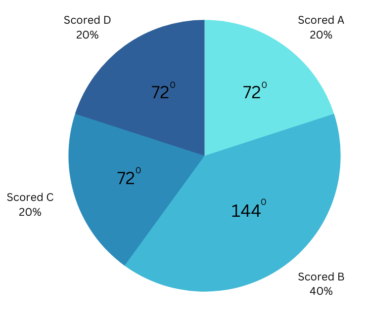
5. Below is a histogram that shows the grades scored by students in a class. Draw the corresponding pie chart.
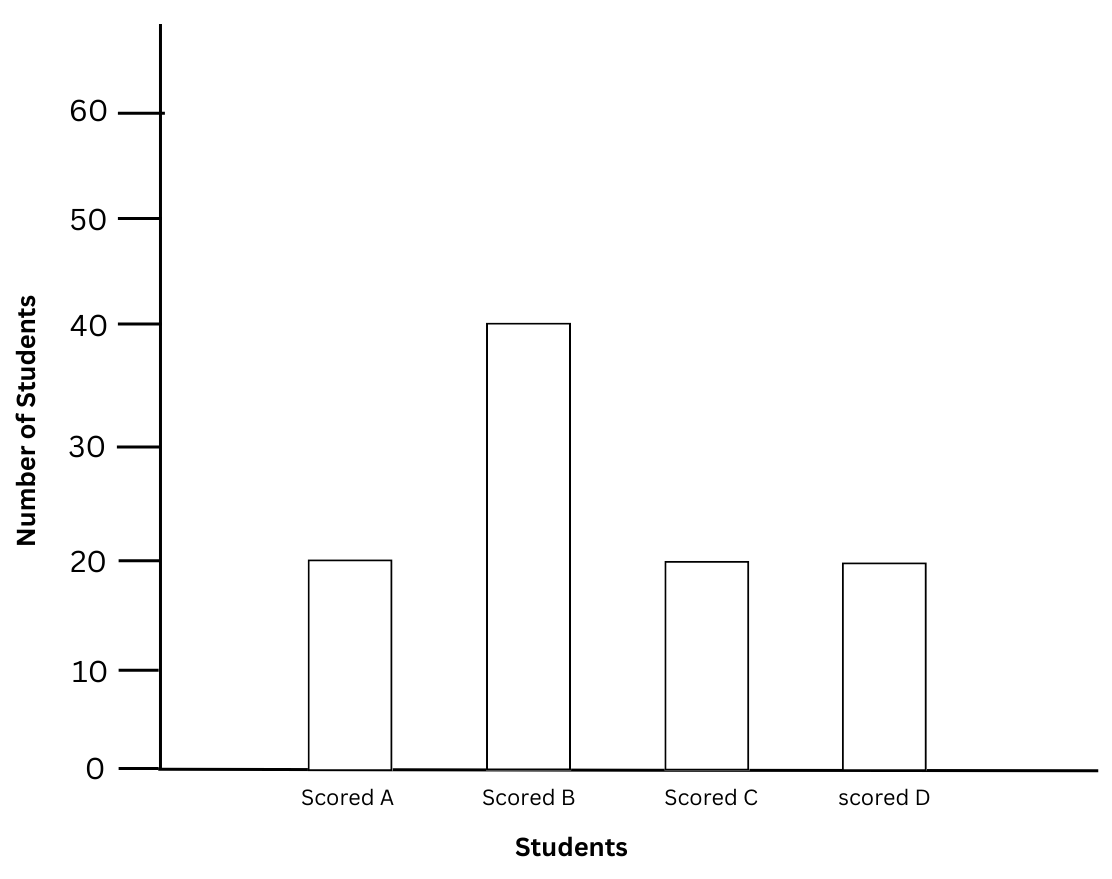
Answer: According to the histogram,
Number of students who scored A = 20, number of students who scored B = 40, number of students who scored C = 20, number of students who scored D = 20.
Total number of students = 20 + 40 + 20 + 20 = 100.
To make the pie chart we first make a table to find the central angles of the sector:
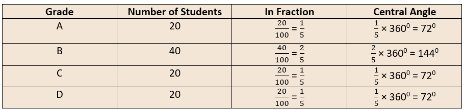
Then using a protractor we make the pie chart below:
6. There are four sectors in a pie chart. The percentages of two are 20% and 45%. Out of the remaining two sectors one sector is half the other. What are the percentages of the remaining two sectors?
Answer:
The total percentage of the two sectors given to us together = 20% + 45% = 65%.
Let the percentage of the bigger sector among the two remaining sectors be x.
Therefore, the percentage of the smaller sector among the two remaining sectors be .
The percentages in a pie chart add up to 100%.
Therefore,
65% + x + x/2 = 100%
or, 3x/2 = 100% – 65%
or, 3x/2 = 35%
or, x = 35% × 2/3
or, x = 23.33%
or, x/2 = 11.67%
Therefore, the percentages of the remaining two sectors are 23.33% and 11.67%.
7. There are some green, red and yellow balls in one bag and some more green, red and yellow balls in another bag. The total number of balls in each bag is 100. The pie charts for the two bags are given below:
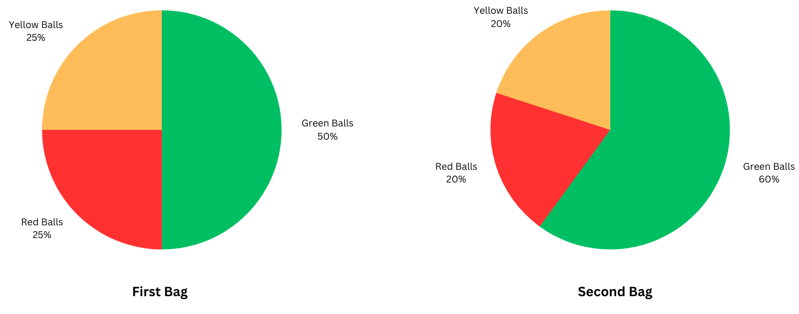
Now if the balls in the first bag are combined with the balls in the second bag, what will the pie chart look for the new combination?
Answer:
First Bag:
From the pie chart we get:
Percentage of green balls = 50%.
Number of green balls = 50/100 × 100 = 50.
Percentage of red balls = 25%.
Number of red balls = 25/100 × 100 = 25.
Percentage of yellow balls = 25%.
Number of yellow balls = 25/100 × 100 = 25.
Second Bag:
From the pie chart we get:
Percentage of green balls = 60%.
Number of green balls = 60/100 × 100 = 60.
Percentage of red balls = 20%.
Number of red balls = 20/100 × 100 = 20.
Percentage of yellow balls = 20%.
Number of yellow balls = 20/100 × 100 = 20.
When the balls are mixed:
Number of green balls now = 50 + 60 = 110.
Number of red balls now = 25 + 20 = 45.
Number of yellow balls now = 25 + 20 = 45.
Total number of balls = 200.
Percentage of green balls = 110/200 × 100 = 55%.
Percentage of red balls = 45/200 × 100 = 22.5%.
Number of yellow balls now = 45/200 × 100 = 22.5%.
Pie Chart of Mixture:
Using a protractor the pie chart of the combined mixture is drawn below:

8.The probability that it rains on a day is 3/5. What is the probability that it does not rain on that day?
Answer:
There are only two possible outcomes: either it rains or it does not rain.
The probabilities of the two possible outcomes add up to 1.
Therefore, the probability of the outcome that it does not rain on that day = 1 – 3/5 = 2/5.
9. Number 1 – 10 are written on ten separate slips and kept in a box. One slip is chosen from the box without looking inside. What is the probability of drawing an odd number?
Answer:
The odd numbers from 1 – 10 are: 1, 3, 5, 7, 9.
Therefore, the number of possible outcomes of getting an odd number = 5.
The total number of outcomes = 10.
Therefore, probability of getting an odd number = 5/10 = 1/2.
10. Take a square cardboard piece, draw one diagonal of the square and shade one half. Now close your eyes, rotate the cardboard piece several times and try to put your finger on the shaded half. What is the probability that you will put your finger on the shaded half?
Answer:
When you close your eyes and rotate the cardboard piece you do not know which way the cardboard piece is oriented.
The diagonal of the square divides it into two halves of equal area.
So, the area of the shaded half = 1/2 the area of the square.
Hence, when you put your finger on the square piece the probability that it will fall on the shaded area = 1/2.
Fill in the Blanks:
a) The ________ of the rectangles in a histogram is the class intervals.
(b) When you toss a coin the two outcomes are ________ likely.
(c) Histogram consists of ________ values and pie charts consist of ________values.
(d) The range of probability values is from ________ to ________.
(e) The probability of selecting an even number from 1 to 20 is ________.
Answers:
(a) The width of the rectangles in a histogram is the class intervals.
(b) When you toss a coin the two outcomes are equally likely.
(c) Histogram consists of absolute values and pie charts consist of percentage values.
(d) The range of probability values is from 0 to 1.
(e) The probability of selecting an even number from 1 to 20 is 9/20.
Frequently Asked Questions (FAQs) on NCERT Solutions to Class 8 Mathematics Chapter 4 Data Handling:
These solutions and extra material have been designed by an expert team of Indian and foreign-educated teachers, engineers and scientists. They have designed them logically and scientifically to ensure maximum learning and retention. All the techniques you need to know are explained with attractive figures wherever necessary. You will find similar concepts and problems in your exams, so practise them on your own as well.
The free PDFs of the solutions are available for download anytime! If you like our material and want plenty more from us, keep visiting our website and subscribe to our email list. We will send all the latest study material and other resources that you need straight to your inbox!
The following topics are covered:
4.1 – Looking for Information
4.2 – Circle Graph or Pie Chart
4.3 – Chance and Probability
Here are the number of problems for the chapter:
Exercise 4.1 – 5 Problems
Exercise 4.2 – 6 Problems
Yes of course! You can download the PDF version of educationroundtheworld.com’s NCERT Solutions for Class 8 Science Chapter 4 Data Handling anytime you please! The solutions including the self-designed extra questions are included in the PDF version! Please look towards the top of the page to find the download button!
Understand the differences between bar graphs, histograms and pie charts and how each is used. Learn to draw and interpret them and practise numerical problems based on them. The last part of the chapter deals with probability. Understand how to list outcomes in an experiment and how to use that to calculate probability. Alongside the solutions we have also designed extra problems on all the topics. These questions are designed to clear your concepts, resemble exam problems and are an excellent place to begin your practice. We only advise that you practise the problems yourself while studying the solutions to extract maximum benefit.
Need us to teach you? Mathematics can be an amazing subject if taught the right way. Alongside structured exam preparation, our teachers will help you realize the inherent love that you have for the subject. Feel free to contact us anytime and we’ll love to help you out!
Alongside rigorous training, our teacher-mentors also provide excellent counselling regarding your future academic and professional careers. We have found that this approach gives students confidence and prepares them well for their future.
We provide expert one-on-one coaching and mentoring to you depending on your convenience and needs – have it completely your way! Feel free to reach out to us with your requirements anytime and let us help you out! Book an appointment now!